This past year, we took an interesting and educational journey with a client to develop e-learning accessibility. Technically, much is already possible in this area, and we know the capabilities and limitations of development tools pretty well by now. At the same time, developing an accessible learning solution is challenging. After all, we need to combine accessibility guidelines and technical capabilities from the tools with the growing customer demand for customized digital learning solutions with a unique learning experience.
What is digital accessibility?
You can think of digital accessibility as removing barriers and adding signposts. Just not in outdoor space, but digitally. Digital accessibility is about the way websites, apps and thus digital learning solutions (such as e-learning) are made. They are digitally accessible if any visitor, including those with disabilities, can use them. The standards for digital accessibility are described in the Web Content Accessibility Guidelines (WCAG). These standards consist of four basic principles: observable, operable, understandable and robust. Testable success criteria at levels A, AA and AAA determine whether something meets WCAG.
But I’m also taking employees to task. Why do they do this work? What’s fun about it? What does their life look like? And no, far from all that information is needed for the final product. But it helps to get a sense. A sense of who these people are. I think it is an illusion to be able to fully understand their work and world in such a short project period. But I can come up with a solution that allows them to continue learning. And every piece of information can help strike the right chord.
The basics of developing accessible digital learning solutions are well met. Consider using color with the right contrast ratio for people with color blindness. Or use subtitles in videos and animations for people with auditory disabilities (we’re not just talking about people who are deaf or hard of hearing here, but also think, for example, of people who are temporarily hard of hearing due to an ear infection).
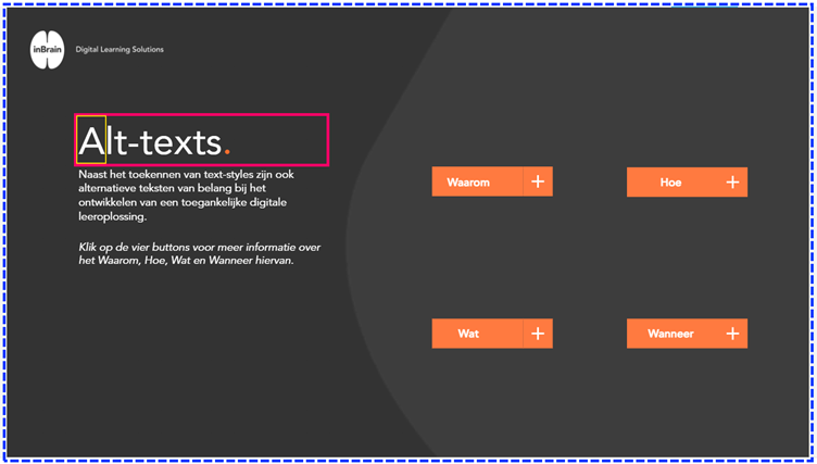
Do you dare to look at it a little more technically? We can pass “text styles” to text, or headings, in the tools. A header list helps users using pre-reading software (a screen reader) or an “accessibility tree” to navigate through the headings. Thus, they quickly get a picture of the content on a page. The image below shows an example of such an accessibility tree.

Users who cannot operate a computer mouse, such as because of a motor disability or temporarily because of a broken arm, use the keyboard or a screen reader to navigate a page. For this, we set up the “focus order” in our tool. The focus order determines the reading order on the page for a screen reader.
Including text alternatives to images, buttons or tables, for example, is also an easy step toward digital accessibility. Auxiliary software recognizes the “alt-texts” and reads this to the user as soon as the user arrives at this element from the focus order. And that requires the right settings. Why? Let’s do a little experiment. First, look at the image below.


