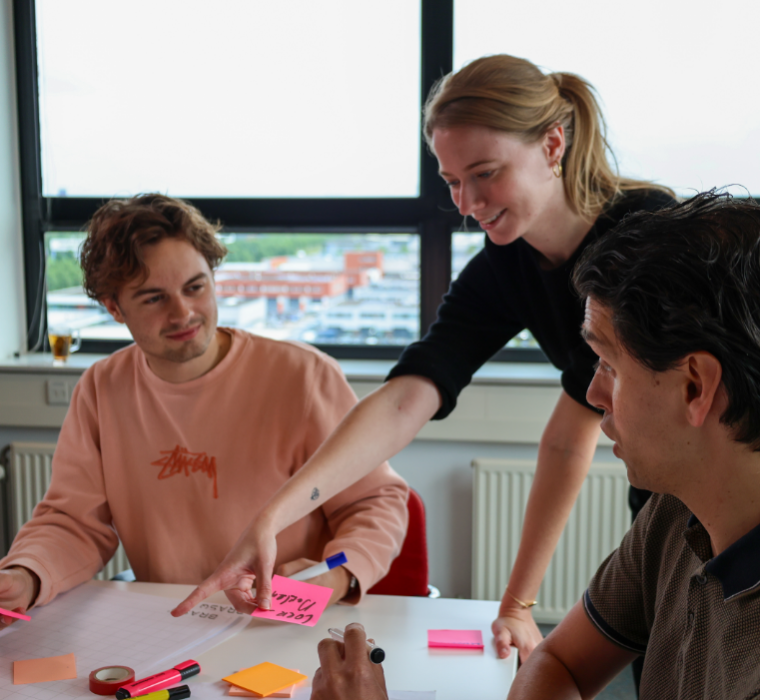

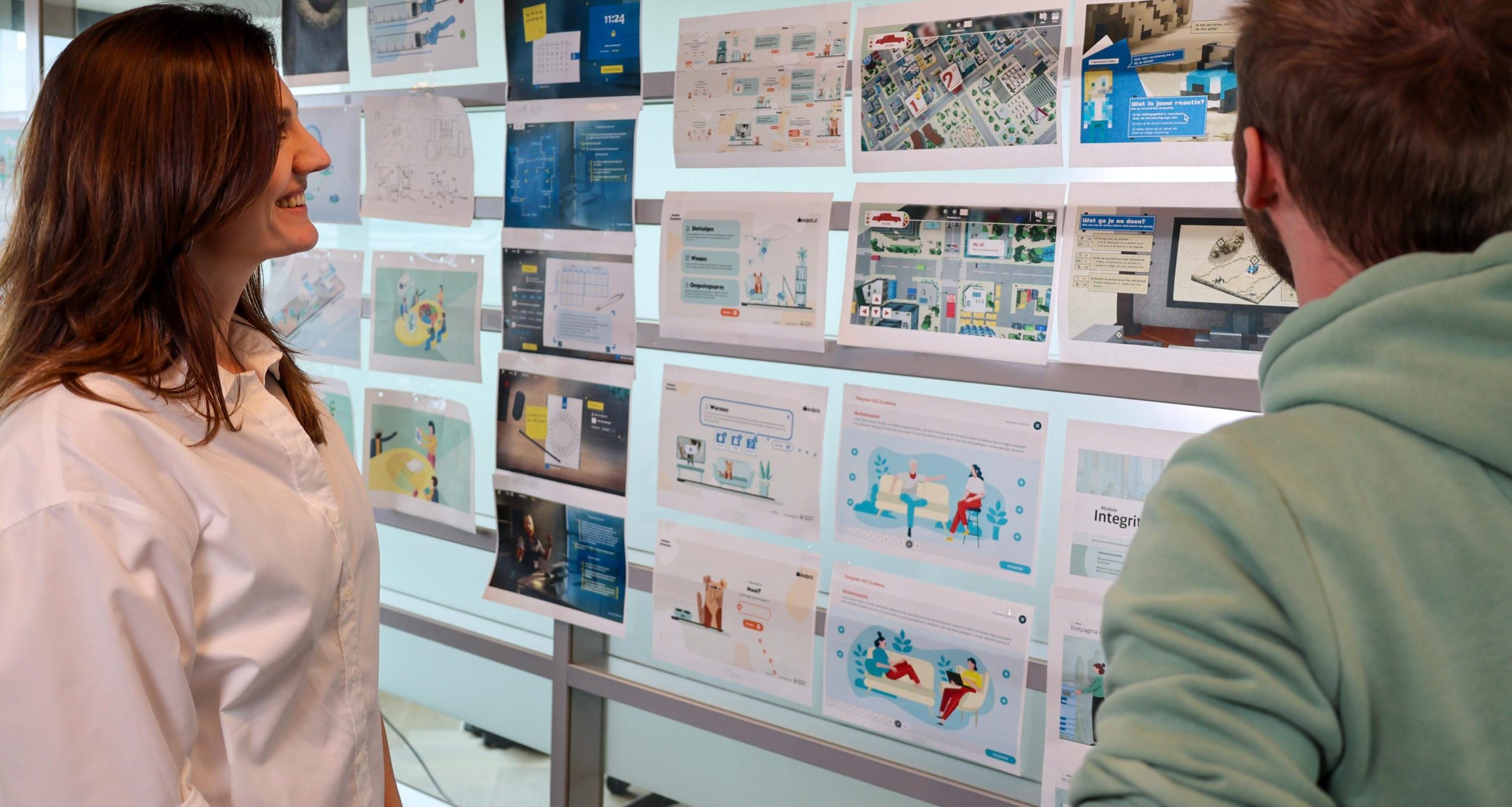
At inBrain, we always carry out our projects in a fixed formation: a project manager, a digital learning specialist and a digital designer. The project manager ensures that everything goes according to plan and within budget. The digital learning specialist works on creative, didactically sound and motivating learning content. And the digital designer takes care of the (visual) design of the learning solution. These roles work closely together within our projects. They have to, because didactics and design are strongly intertwined in our field. In this blog, I’ll show you how.
As an educator, you try to motivate the target group to learn as much as possible. It should be a basic attitude: people already have to learn and they do not always enjoy it, so it is better to make it a little entertaining and surprising. Achieving the learning goals is, of course, always paramount. And to achieve that goal, another inevitable term emerges: preventing cognitive overload. This is precisely where didactics and design come together beautifully.

Cognitive overload
Our brain has only a limited working memory. At some point the “bin” is full and the brain no longer absorbs the information: cognitive overload! When designing a learning solution, as an educator you must ensure that a participant can learn as optimally as possible. By offering content in small chunks, for example, to avoid a tsunami of information. Or by paying attention to logical sentence structure and clear language. That way, a person does not spend unnecessary energy dissecting the sentence and someone’s focus can go entirely to the content. In this way, an educator has a great deal of influence in reducing a participant’s cognitive load.
Visual design also makes an important contribution. In terms of design, there are all kinds of proven ways to reduce a participant’s cognitive load. Consistency is the key. Consider consistency in navigation (for example, always putting the menu button in the same place). Consistency in the design of buttons (for example, giving each action button the same (action) color). Or consistency in the text on buttons (for example, do not use ‘Next’ and ‘Next’ interchangeably). This way you make sure someone understands faster how the learning solution works. And that they need to spend less brain power on it. The participant can use that energy to absorb the learning material.
Too beautiful design
Design is communicating through images. Using design, you can divide and emphasize information on a page. Applying contrast and hierarchy is an important tool here: this way you can visually emphasize which information is important and which information is supportive. For example, make sure you don’t hide the most important information behind an interaction, but that it is immediately in view. People consider information that is not evenly visible to be less important relative to information that is evenly visible. The core message should be read right away, while you can use the click-to-reveal for an example or further depth.
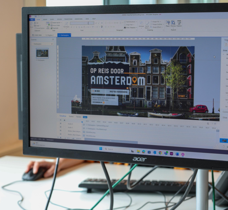
When working out the visual design, an interesting paradox comes around the corner. Of course, our digital designers are largely concerned with making a learning solution visually appealing. But did you know that there is also such a thing as “too beautiful a design”? In that case, the beautiful design actually distracts from the actual goal: learning. And then although the design is beautiful, it is absolutely unsuccessful. Avoiding this paradox therefore requires very conscious design choices. The design must always support the purpose of the learning solution, so every image, icon or other visual element must have a function. Is there no purpose or function? Get rid of it!
Free fact sheet: 7 tips for combining didactics and design
Didactics and design cannot exist without each other in the mission to prevent cognitive overload. And so in a learning solution, you will have to combine both disciplines as best you can. Of course, they are two separate fields and you cannot expect an educationalist to be a full-fledged designer at the same time. And vice versa. We have separate functions for that at inBrain for a reason! But start by realizing that good educational design cannot exist without good visual design. And that a good visual design of a learning solution is nothing without a strong didactic story.
Taking the first step in this? Below you can download a handy fact sheet with 7 important points of attention when designing a (digital) learning solution. For each point of interest you will find a double tip: one from an educational perspective and one from a designer’s perspective. So you can start combining didactics and design. And would you like to take your learning solution to an even higher level? Feel free to contact us, we are happy to provide you with advice.
Read on!